Quick Answer
Creators and makers use QR codes to connect physical products, event booths, and print materials to digital destinations like shop pages, care instructions, social profiles, and media kits. Use static codes for anything on merchandise or packaging, and label every code with what the scan does.
I go to farmer’s markets a lot, and over the past couple of years I’ve started noticing which creator booths use QR codes well and which don’t. The good ones share a pattern. One clear code on a small acrylic sign at eye level, a short label that says exactly what scanning does (“See the full collection,” “Order custom,” “Care instructions”), and a destination that loads fast on cellular. The bad ones tend to have either no code, a code wedged into a corner without context, or three codes side-by-side that nobody can decide between. The booths with one well-placed code get scanned often enough that the maker mentions it during conversations with new customers.
The same pattern shows up at every craft fair, pop-up, and small retail moment where physical work meets a stranger. A market booth at the edge of a fair, a sticker on a shipping box, a hang tag on a handmade ceramic mug. Each is a tiny window where someone is holding something tangible and might want to know more, and in each case there’s no room for a paragraph of explanation or a long URL. QR codes fill that gap. They turn a physical moment into a digital action.
Two contexts that change what the code should do
QR codes serve creators differently depending on whether the moment is digital-first or physical-first.
Digital-first contexts are conference badges, networking events, presentation slides during talks, media kits shared with brands, business cards at meetups. The moment is professional; the destination usually serves a follow-up rather than a sale.
Physical-first contexts are product tags on handmade items, booth signage at craft fairs, packaging inserts and thank-you cards, retail displays where you aren’t present. The moment is the encounter with the work; the destination usually serves the next step in the customer relationship.
The same QR code can work in both, but the destination changes. A presentation QR code might link to your main profile. A product tag might link to care instructions. Understanding the moment shapes the link.
What to link, by intent
The link matters more than the code itself. Decide what the scan should accomplish before generating anything.
For growing an audience (new followers or subscribers), the most common destinations are your main profile page, a link page like Linktree or your own site if you’re active across multiple platforms, or a subscribe-prompt URL on YouTube (the ?sub_confirmation=1 parameter fires the subscribe prompt). These work well on business cards, event badges, and presentation slides.
For professional opportunities (brands, clients, collaborators), link to a media kit PDF that replaces email attachments and follow-up messages, a portfolio page that lets the other party preview your work without needing a meeting, or a contact and booking page that reduces back-and-forth.
For product sales (customers already holding your work), link to care instructions that update once and apply everywhere, a behind-the-scenes page with material sourcing or process photos, a reorder or shop page that says “If you loved this, here’s what else,” or a review request that goes directly to where you collect feedback. The customer has already bought in; give them useful next steps rather than more marketing.
For events and markets, link to an online shop category page (“See more colors and styles”), an email signup that captures contact info for follow-up, or a custom order page that explains timelines and pricing before the email inbox fills up.
At a busy booth, one clear QR code outperforms five that create confusion.
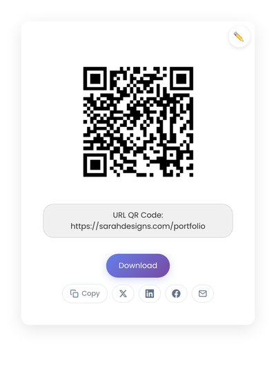
A static QR code pointing to a creator portfolio URL. Generated in the browser; no service sits between the booth sign and the destination.
Placement strategies that actually work
A code in a corner gets ignored. A code where someone naturally pauses gets scanned.
On business cards, place it in the bottom third with enough size to scan. Pair with a short label like “See my work” or “Connect with me.”
On product hang tags, the back of the tag works well. Label what the scan does: “Care instructions” or “Meet the maker.”
In packaging, drop a card inside the box that the customer sees after the unboxing moment. That’s the quiet point when they have time to explore.
On posters and booth signage, scale with viewing distance. A code meant to be scanned from six feet away needs to be significantly larger than one on a business card. A framed sign or acrylic stand at eye level draws more scans than something flat on the table.
On slides during a talk, keep the QR code visible during Q&A and closing remarks. Give people time to react and scan.
On live streams, display in a corner of the frame, large enough to actually scan, and consider showing it during transitions or wrap-up segments.
On thank-you cards inside orders, this is prime real estate for a reorder or follow prompt.
Static vs dynamic, for creators
For most creator and maker uses, static codes are the right choice. Shop URLs, profile pages, and care instruction pages don’t change often. You want codes on merchandise and packaging to keep working indefinitely without subscription fees.
Dynamic codes earn their keep for short-term promotions where the destination rotates frequently. When in doubt, start with static. Fewer moving parts mean fewer things to break. The static-vs-dynamic breakdown covers the longer reasoning.
Technical details
Size guidelines:
- Business cards: at least 0.8 inches square.
- Product tags: at least 0.75 inches square.
- Posters and booth signs: scale with the distance people will scan from.
- Slides: test scanning from the back of the room before going live.
When in doubt, go larger. A code that’s hard to scan doesn’t get scanned.
Contrast and clarity:
- Dark code on a light background scans most reliably.
- Avoid photos or textured backgrounds behind the code.
- Leave clear space (the “quiet zone”) around all edges.
- Black on white is the safest choice. Brand colors and logos can work, but test thoroughly before printing in volume.
Labels increase scans. A short line of text removes the small hesitation that loses casual scans. “Scan for care instructions.” “See more of my work.” “Follow my studio.” “Watch how this was made.” Clear language beats clever framing.
The process, end to end
- Decide the destination first. Test the URL on your phone. Does it load quickly on cellular? Does it look good on mobile?
- Generate the static code on StackQR and download both PNG (for screens) and SVG (for print) so you have the right file for each material.
- Test on at least two different phones in different lighting.
- Save with clear filenames so you can reuse:
shop-qr.svg,care-instructions-qr.svg. - Add to materials in your next print run rather than rushing to replace everything at once.
Managing multiple codes as you grow
Codes accumulate. Keep them organized:
- One folder for all QR image files.
- Descriptive filenames.
- A short document listing where each code appears, so you can update materials if a destination URL ever needs to change.
- Quarterly review of every linked page for accuracy.
An outdated link (to a discontinued product, sold-out item, or closed shop) damages trust more than no QR code at all.
How this plays out at the booth
The pattern I see at the farmer’s markets that work: one framed sign on the table, eye level, with a code labeled “See the full collection.” The code points to a category page in the shop showing every color and size in the maker’s range. Customers browse while waiting, and a fair number order later from home.
On each piece, a small sticker on the bottom links to a care page with cleaning tips, dishwasher guidance, or whatever applies. The page updates once whenever advice changes; every piece the maker has ever sold links there.
For a creator speaking at a conference, the same logic applies in a different setting. A QR code stays visible on the closing slide during Q&A; many attendees scan during the actual question period. The business card carries a separate code that points to a media kit, which is more useful when networking with potential sponsors.
For online orders, a thank-you card with two distinct codes (one for care instructions, one for “Leave a review”) tends to outperform a single combined link. Separating distinct actions increases completion.
Common mistakes
A few patterns show up across creators.
Linking to desktop-only pages. Always check that the destination loads cleanly on mobile. Cramped text and slow loads kill conversions.
Too many codes in one place. A booth with five QR codes creates choice paralysis. One or two per touchpoint is enough.
Codes too small to scan. If it’s frustrating to scan, people give up.
Linking to outdated content. Sold-out items, old prices, broken pages. Review the destinations periodically.
Forgetting offline contexts. Markets and events sometimes have weak cellular signal. Lightweight pages load more reliably than image-heavy ones.
When a QR code isn’t the right tool
The code works poorly when the viewer doesn’t have their phone, the environment is too dark to scan, the code is too far away, or the audience isn’t familiar with QR codes. In those cases, a short readable URL underneath the code keeps the path open for everyone.
Measuring success without overthinking it
Watch the booth. People pull out phones and point them at your sign; that’s confirmation. After the market, followers mention they scanned at your table. Care questions drop because customers find the instructions themselves.
Your shop analytics show the rest: traffic to the care page correlates with sales, portfolio visits spike after conferences, the “how I found you” field in custom orders mentions the product tag. Scan counts matter less than outcomes. A code on packaging that three people scan per month still works if those three become repeat customers who found your full catalog.
QR codes give creators a practical bridge between physical and digital work. A product card becomes a path to your shop. A business card becomes a path to your portfolio. A booth sign becomes a follow. The constraint worth enforcing is one code per purpose: stacking three codes (shop, Instagram, newsletter) on one tag reliably gets fewer scans than picking the single most important link and printing only that.