Three steps, then the reasons
A QR code for a Google Form encodes your form’s share link into a scannable image. Place it on signs, receipts, or slides, and people scan to open the form instantly on their phones. Static QR codes work permanently as long as the form link stays active.
- In Google Forms, open the share dialog (the Send or Publish button, depending on which version of the interface you see), click the link icon, and copy the responder URL.
- Paste that link into StackQR and generate the code.
- Download as PNG for screens or SVG for print, and scan the printed result on two phones before printing at scale.
That’s the working version. The rest of this article explains why each step matters and where form QR codes go wrong.
Google Forms has no built-in QR code feature. The share dialog offers a link, an email option, and an embed code, and that’s it. So the QR step always involves an outside tool, and Google hands out form URLs in the shape of docs.google.com/forms/d/e/1FAIpQLSdXyZ.... That string is unusable on a printed sign. Nobody is going to type forty random characters into a phone keyboard while standing in line, no matter how much they want to leave feedback or sign up for the thing on offer.
A QR code collapses the whole step. Scan, the form opens in a browser, the person taps through the answers, and the response lands in your spreadsheet before they walk away. The pairing is well-suited to the kinds of contexts where Google Forms already gets used: classroom quizzes, post-event surveys, waitlist signups at trade booths, customer feedback at a counter.
Why this pairing works
Google Forms are familiar. Most people recognize them instantly. They load quickly on mobile, require no login for basic responses, and look reasonably presentable even without customization. QR codes match that simplicity: scan, tap, answer.
The combination shines where the audience is offline and the form is the next step. Café tables collecting feedback. Retail counters asking for email signups. Clinics sharing intake or satisfaction forms. Classrooms distributing quizzes or assignments. Event booths capturing leads.
In each case the person is already there. The QR code meets them in that moment without interrupting it; if they want to respond, they scan. If not, the code waits without making noise.
Common use cases
Customer feedback codes go near the exit, on the receipt, or on the takeout box. Forms ask the one or two questions that matter and skip the rest. Short forms perform better than long ones.
Event sign-ups and check-ins use QR codes on entry signs to register attendees, collect emails for follow-up, or share a post-event survey. A printed sign at the door covers most of it. If the event workflow itself is the question (invitations, headcounts, reminder timing), the event RSVP guide owns that territory; this article covers the Forms mechanics.
Internal forms for staff or students benefit from QR codes posted in shared spaces. Safety checklists, shift availability forms, classroom quizzes, training confirmations. Posting the code in one consistent place removes the “which link should I use?” confusion.
Product or packaging inserts can include a QR code for warranty registration or product feedback. This works best when the form is short and the value of completing it is clear (a warranty extension, an entry into a drawing, a quick service follow-up).
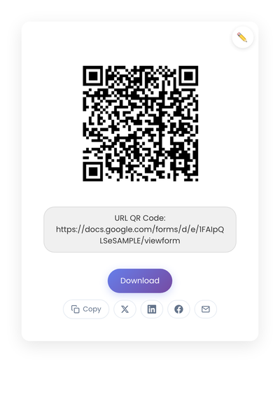
A static QR code encoding the Google Form share URL. The form handles every part of the response collection: validation, conditional logic, the spreadsheet on the back end.
Getting the form ready before generating the code
A QR code increases form traffic. Make sure the form is worth the traffic. A few habits help.
Keep it short. If completion takes longer than 60 seconds, cut questions. People scanning a QR code are usually standing, waiting, or passing by. Aim for one clear purpose, five to ten questions max, and mostly multiple choice or short answer.
Optimize for mobile. Most scans happen on phones. Keep questions within thumb-reach zones, make sure the form loads quickly on cellular, and ensure the submit button is easy to find. Desktop usage is secondary but worth a quick check.
Write a clear title and description. The first few seconds after scanning matter. “Quick Feedback Survey: Takes 1 Minute” sets expectations and reduces drop-off compared to a vague title. Clarity builds trust.
Static or dynamic for a form link
Static QR codes are almost always the right choice for Google Forms. Form share URLs stay stable, so the editable destination a dynamic code offers isn’t worth the subscription cost. If the tradeoff is new to you, the static vs dynamic comparison lays it out in full.
Placement and labeling
Place the code where the decision actually happens. After payment at the counter. While someone is waiting for a service. At the end of an event. On the last slide of a presentation. Codes tucked into places people rush past stay unscanned.
Add a short label so people know what scanning does. “Scan to leave feedback.” “Scan to sign up.” “Scan to rate us.” Two or three words remove the small hesitation that loses casual scans.
Size for the distance. At least 1 inch by 1 inch for arm’s-length scanning. Larger for posters or signs where the scan happens from across a table or a room. Black on white is the safest contrast choice; brand colors look beautiful in mockups and lose scan reliability in the field.
Mistakes that lower form responses
Most failed form codes trace back to one of five decisions.
Using a URL shortener inside the QR code. Shorteners can expire or change behavior. Embed the full Google Forms link to remove that dependency.
Relying on a free dynamic QR service. Many introduce scan caps, expiration dates, forced branding, or codes that stop working when a trial ends. If the code goes to print, it shouldn’t depend on a trial subscription.
Treating the QR code as a fix for a long, confusing form. The code only increases access; it doesn’t improve completion. If response rates are low, the issue is usually the form, not the scan.
Ignoring privacy expectations. People scanning a code in a physical space don’t expect device tracking on top of the form they’re filling out. Tools that log scans add friction even if technically permitted.
Skipping accessibility. The QR code should never be the only path to the form. Include a short URL backup and offer staff assistance for anyone who can’t scan.
When a QR code is the wrong tool for your form
Skip the code when the audience is already online. If people reach your form from an email, a chat message, or a website, send the link itself; a QR code on a screen someone is already using just adds a step. Skip it for forms that require signing in to a specific account, since the scan often opens in a browser that isn’t logged in, and the sign-in wall kills completion. And if only three people need the form, hand them the link. The code earns its place in physical spaces with strangers, not in workflows you already control.
Two real situations worth planning for
Forms change. If you rework the question structure but keep the same share URL, the printed code keeps working. If you have to replace the form entirely, leave the old form active with a redirect note so any in-circulation code still leads somewhere useful, or print a sticker over the old code on visible signage.
Multiple forms in one location need multiple codes. Don’t print a single ambiguous code and hope the destination page disambiguates. Codes labeled “Dine-in feedback” and “Takeout feedback” placed side by side outperform one combined entry point because each scan starts the person in the right context.
A Google Form QR code needs three things to work: a short focused form, a visible placement, and a stable link. Get those three right and the response rate looks more like a counter survey at a register than a link buried at the end of an email.