Quick Answer
A website QR code is only as good as the URL inside it. Link the specific page that answers the scanner’s question (not the homepage), encode the full https:// address, keep the path stable so the code survives a site refresh, and use a static code so there’s no subscription that can break the link later.
One website QR code I keep coming back to is my own. The image StackQR uses when the site gets shared, the one with the wordmark on it, has a working QR code built into the picture, pointing back to the site. The same image sits on the Twitter profile. One image doing two jobs: branding, and a way in.
The part worth noticing is when that code actually matters. If the link is already on the device you would act on, the code adds nothing. You tap or click it and you are there. The code earns its place when the address shows up on a screen that is not the device you would act on. I run into this watching YouTube on the TV: creators put a QR code on screen because the link sitting in the description does nothing for someone on the couch ten feet away. The phone is in your hand, the link is on the wall, and the scan is the bridge between them. A slide on a projector works the same way. So does the StackQR image when it lands in a feed someone is scrolling on a laptop.
That gap, from a screen you can see to the phone you are holding, is the whole reason a website QR code exists. The code stores one thing: a URL. The phone camera reads the pattern, the browser opens the address, and that is the entire mechanism. No app, no account, no redirect in between when you use a static code. Everything that decides whether the code works or gets ignored comes down to the address you put inside it and the page it opens.
So what actually makes one of these work? Three things: which URL you encode, how you structure it so it keeps working, and how you print it so it scans reliably. The link might point to a one-page personal site, a portfolio project, a conference talk, a product manual, or a storefront menu. The destination changes; the rules for wiring it into a code that lasts do not.
Pick the URL before you generate anything
The most common mistake is encoding the homepage. A homepage serves every possible visitor. The person scanning your code is not every possible visitor. They have one question in mind at the moment they point their camera, and a homepage makes them hunt for the answer.
Encode the page that answers that one question directly. A portfolio postcard points to the specific project, not the landing page. A conference slide points to the talk’s resources, not your company site. A printed manual points to the support page for that exact model, not a general help center.
The homepage is fine when the homepage is the whole thing. StackQR’s own code points at the homepage because the generator runs right there, so the front page is the answer, not a lobby someone has to walk through. A one-page personal site, a Carrd or link-in-bio page, a single-product landing page: same deal. The rule is not “never the homepage,” it is “encode the page that answers the question,” and sometimes that page is the homepage. The trouble only starts when a site has many pages and the code dumps everyone on the front door anyway.
Before generating, settle three things about the URL:
- The action. What should the scanner be able to do on the page? Read something, download a file, pay, register, book.
- The completability. Can they finish that action on the page they land on, without a second navigation step? Each extra tap between scan and goal loses people.
- The lifespan. Will this URL still point at the right thing in a year? A path tied to a moment (
/sale-spring-2026) ages out; a stable path (/menu,/support,/rsvp) does not.
The landing page test
Open your destination URL on a phone before generating the code. Actually do it. Don’t skip it.
Check the load time. If the page takes more than three seconds on a decent cellular connection, you’ll lose scanners. Heavy images, tracking scripts, and chat widgets add up.
Check the mobile layout. Can you read the text without zooming? Are buttons large enough to tap accurately? Does the page require horizontal scrolling?
Check immediate clarity. Within five seconds of landing, does a visitor know what they can do here? Ambiguous pages create bounce.
Check for obstacles. Does a cookie banner cover half the screen? Does a newsletter popup appear before content loads? Does a login wall block the content entirely? A scanner who hits a sign-in screen usually leaves, since few people create an account on the spot. Put the useful content in front of any login.
If your page fails any of these, fix the page before printing QR codes. A fast path to a bad destination is still a bad experience.
A static QR code pointing to a website URL. The destination is encoded directly into the pattern; the work happens at the link and on the page behind it.
The URL for each context
The right address depends on where the code lives and what the scanner is trying to do. A few patterns cover most cases.
| Where the code lives | URL to encode | Not this |
|---|---|---|
| Portfolio postcard | the specific project | homepage |
| Conference slide or handout | /talks/2026-slug |
company landing page |
| Product package or manual | /support/model-123 |
general help center |
| Event invite or flyer | the event or RSVP page | organizer homepage |
| Personal card | /contact or booking page |
homepage |
| Restaurant table card | /menu |
homepage |
The pattern holds across every row: encode the deepest page that still answers the question on its own. The homepage is almost never that page.
Static vs dynamic, for websites
For anything printed or shared with an intended lifespan over a few months (cards, signs, packaging, slides, a social profile image), static codes are the safer choice. They work as long as the URL exists, with no subscription fees or service dependencies.
Dynamic codes let you change the destination without regenerating the image, but they add a vendor in the middle. If the service shuts down or the account lapses, every code pointing through it breaks at once. For a URL you control, static is almost always the right answer. The full picture on static vs dynamic QR codes covers the longer reasoning.
Dynamic codes earn their keep in a narrower set of cases: short-term campaigns with planned destination changes, precise scan attribution, or testing different landing pages against one printed code. Flexibility comes with dependency.
Technical setup
The URL you encode should be complete (include https:// at the start, since some phones handle bare domains less reliably), stable (/menu is better than /menu-spring-2026; page content can change without the URL needing to), clean (avoid unnecessary tracking parameters that clutter the URL), and canonical (use your primary domain consistently rather than mixing www and non-www versions).
Testing protocol before anything goes to print: scan with multiple devices including iPhone and Android, test at the actual printed size (a code that scans on screen may fail when printed at final dimensions), test in real conditions (outdoor codes need bright sunlight testing; codes behind glass need to be tested through the glass), complete the full user journey rather than just confirming the scan, and add a quarterly reminder to scan your active codes and verify destinations still work.
Print specifications: use vector formats (SVG) when possible since they scale without quality loss. For raster images, generate at 300+ DPI for print. Use dark modules on a light background; black on white is the safest contrast. Leave a quiet zone around the code so scanners can find the boundaries. Matte finishes scan better than glossy.
Keeping the URL alive when the site changes
This is the part most people skip, and it’s the reason printed codes break years later. A static QR code holds the URL forever. Your website does not promise to keep that URL forever. The gap between those two facts is where codes die.
Two habits close the gap.
Use redirects when paths change. If a site redesign moves /support/model-123 to /help/model-123, anything already printed still encodes the old path. A permanent (301) redirect from the old path to the new one keeps every existing code working. Set the redirect up before the old path stops resolving, not after someone reports a dead code. And keep the code pointed at a URL on your own domain rather than a link shortener, which is one more service that can lapse and take every code with it.
A redirect only helps if you remember the code exists. A QR code made today might still be on a card, a sign, or an old slide deck years from now, long after you have forgotten the URL it holds. Keep a short list of where each code lives, what it encodes, and when you last confirmed it resolves, so a site migration never silently breaks a code nobody remembered was live. For running that inventory over the long haul, the guide to permanent QR codes goes deeper.
Knowing whether the code is doing anything
You don’t need a QR dashboard to tell whether a website code is working. Your existing page analytics already show it. Traffic to the destination path climbs after the code goes out into the world. If you want clean attribution, encode a dedicated path that appears nowhere else (/m or /scan-menu), so every visit to it is a scan and the count needs no interpretation.
The mobile share of visits to that path is the tell. A website QR code is scanned by a phone, every time, so a jump in mobile traffic to the encoded URL is the code earning its place. If that number stays flat after the code has been out for a while, the problem is usually upstream: the code is somewhere people don’t pause, or the page behind it didn’t reward the scan.
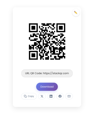
Creating the code
Take the specific URL (the one that answers the question, not the homepage), confirm it loads cleanly on a phone, then generate the code on StackQR. Download SVG for print or PNG for screen. Because the URL is encoded directly into a static code, it keeps working for as long as that address resolves.
The URL is the whole job
Everything that decides whether a website QR code works lives in the address it holds. The right page instead of the homepage. The full https:// instead of a bare domain. A stable path that survives a redesign instead of a one-off. A redirect waiting for the day the path changes. A domain you control instead of a shortener that can disappear.
Get the URL right and the code is almost boring: it points at a page that answers the question and keeps pointing there for years, whether it lives on a business card, a slide, a package, or baked into the image people share. Get it wrong and nothing downstream saves it, because the fast path still leads somewhere broken.